
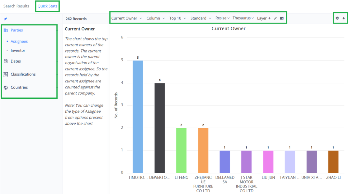
Quick Stats
Analyzing Search Results
In PatSeer you can easily view Quick Statistics for search results or for records in a Project. The search data is interpreted in various types of charts which is easy to understand and analyze.
In the Search Results page you will see two tabs - one for the search results (default) and the second tab is for Quick Stats. This tab works over the search results or the filtered portion of results. (If you have applied a filter)
There are different types of stats either by Application Year or by Assignee and so on. Different tabs represent each of these stats. For each stat a default chart is generated, and you can change the attributes of the chart by selecting the show, chart type, font size, rotate labels, color, and chart size. You can also download the charts.
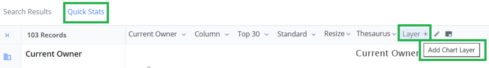
Chart Layers allows you to add multiple dimensions (series) to an existing chart.
Working with Charts
PatSeer Design charts offer you full flexibility to change the look and feel of the chart and also work with different chart items.
Key Attributes of charts
You can change the properties of a generated chart using the options present above the chart. A quick description of each option is given in the table below. The common process is to edit the property as per your need and then save the chart.
| Attributes of charts | Description |
| Show | Allows you to select a definite number of records from the list of records |
| Chart type | Allows you to select the chart type from the options (column, line, area, pie, scatter, radar, bar, bubble, table, circles) |
| Font | Allows you to change the font size for the text in the charts |
| Color | Allows you to change the color of the chart type |
| Legends | Allows you show/hide the legend of the chart |
| Labels | Allows you to change the labels for the Chart title, x-axis Title, and y-axis Title |
| Resize Horizontal | Allows you to resize the chart horizontally |
| Resize Vertical | Allows you to resize the chart vertically |
| Multiple Colour Palettes | You can change the color palette from the option above the chart |
NOTE: When you save the chart as an image the image size and dimensions are proportional to the image you see in the browser. So, the Resize option allows you to set the chart in the right proportions say for a PPT or an A4 page word document and then export it. You will notice that the charting intelligently handles the axis labels when resizing so that they do not appear too big or small in the exported image.
Other chart actions include:
- Drill-down - Clicking on any chart item allows you to drill-down to the records behind the chart. The various records are shown in a split-pane below the chart
- Zoom - If you keep your mouse pressed and drag it from one point within a chart to another, it will zoom into that portion.
- Hide a Dimension - Clicking on any legend name allows you to hide it. Clicking it again makes it visible.
- Copy Chart Values - To copy the values in a chart you can select Chart Type as table and then simply use your mouse to highlight the table values and copy it into clipboard. If you paste this then in excel the values will get pasted as separate rows and columns.
- Export - You can export a chart as Image or PDF using the option present on the top right of the chart. Here you can also print the chart.
- Save Chart - This option is available only within a project. You can save the final chart generated and give a name to the saved chart. All the charts you save are static and do not change even if the project data changes. So, if you share the report with another person, you can be sure the user will see the charts the way you saved it.
Chart Layers - Multidimensional analysis
PatSeer includes a unique chart layering technology that allows you to add any number of dimensions to an existing chart. This feature gives you flexibility and full control over the data points that are included in a chart.
How to use Chart Layers
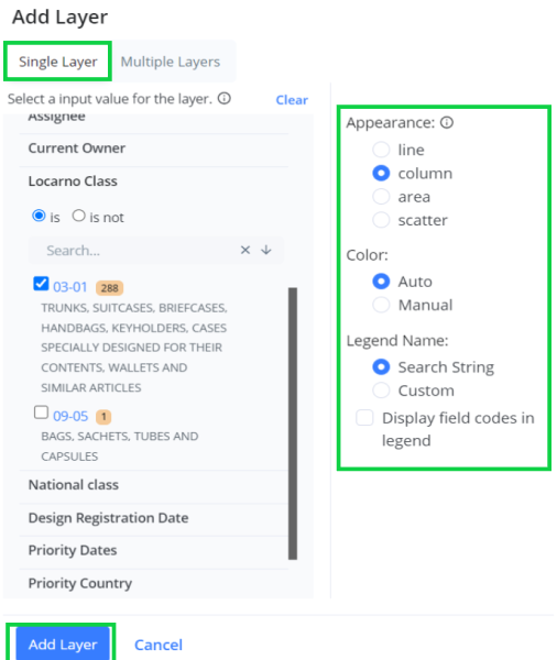
The first step in using chart layers is to decide which types of base chart you want to start with. The different tabs generate a base chart in which the X-axis corresponds to the tab name you select. So, for example if you click on the Assignee tab then you get a chart of the Top 10 Assignees in which each Assignee is on the X-axis of the chart. Once the base is decided then you can add a layer of any other dimension to it.
Let’s explain this with an example. Say if you want to generate an Assignee vs Locarno class chart. For this the first question that you need to ask is what do you want to see as the X axis for your chart? if the Answer is Assignee, then:
- Click on the Assignee tab and then select Top 10/20/50/100 Assignees that you want covered in the chart.
- Next click on Add Layer and expand the Locarno class filter tab. It will show you all the Locarno classes present in the result set.
- Select the first class only and then select layer type as column and then click on Add. You will see that for each Assignee a new column for that Locarno class has been created.
- Click again on Add layer and repeat the process for each Locarno class you want to add. Remember to select only one Locarno Class at a time or else all selected items will get combined into a single layer.
- Once you have added all the layers then right above the chart you will see a checkbox to stack the layers. Clicking on it will stack the layers.
- Finally, if you do not want to keep the "Total" dimension in the chart, simply click on the 'Total' in the legend to hide it.
So, the general rule multidimensional analysis is to first decide what data do you want on the X-axis, select the tab and then add layers on it.
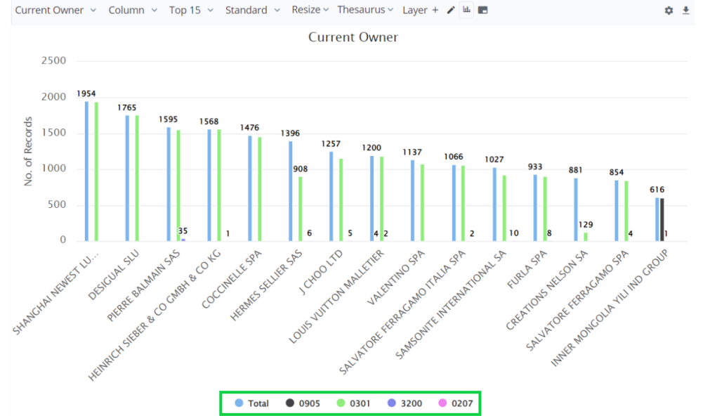
Multi-layer Chart
Add multiple layers, at one go with multiple layers charting option Under Add Layer in quick stats tab. Here, you will see an example of adding multiple layers for a graph of Assignee and the top 5 priority countries for a design search related to Bag or handbag
